
Giving the Simple Gift of Light #10
As I sit down to write about dining room lighting fixture placement, it occurs to me that most people would consider an entire post on this subject a bit excessive. What is there to write about? Just hang a chandelier of some kind over the table, right?
This blog (and my career) exists for one primary reason: there is a better way. Yes, a chandelier over the table can be an important part of the solution, perhaps even the most important part. But our expanding understanding of human health and happiness begs the question: can our dining rooms be more comfortable? More relaxing? Inviting? Functional? Beautiful? Yes, yes, yes, yes, and yes.
As you may already know from reading posts in the Simple Gift of Light series, light can help us wake gently, move with energy, think brilliantly, relax easily, and rest deeply, but only when we have the right light in the right place at the right time.
Let’s get our dining room lights in the right places, yes?
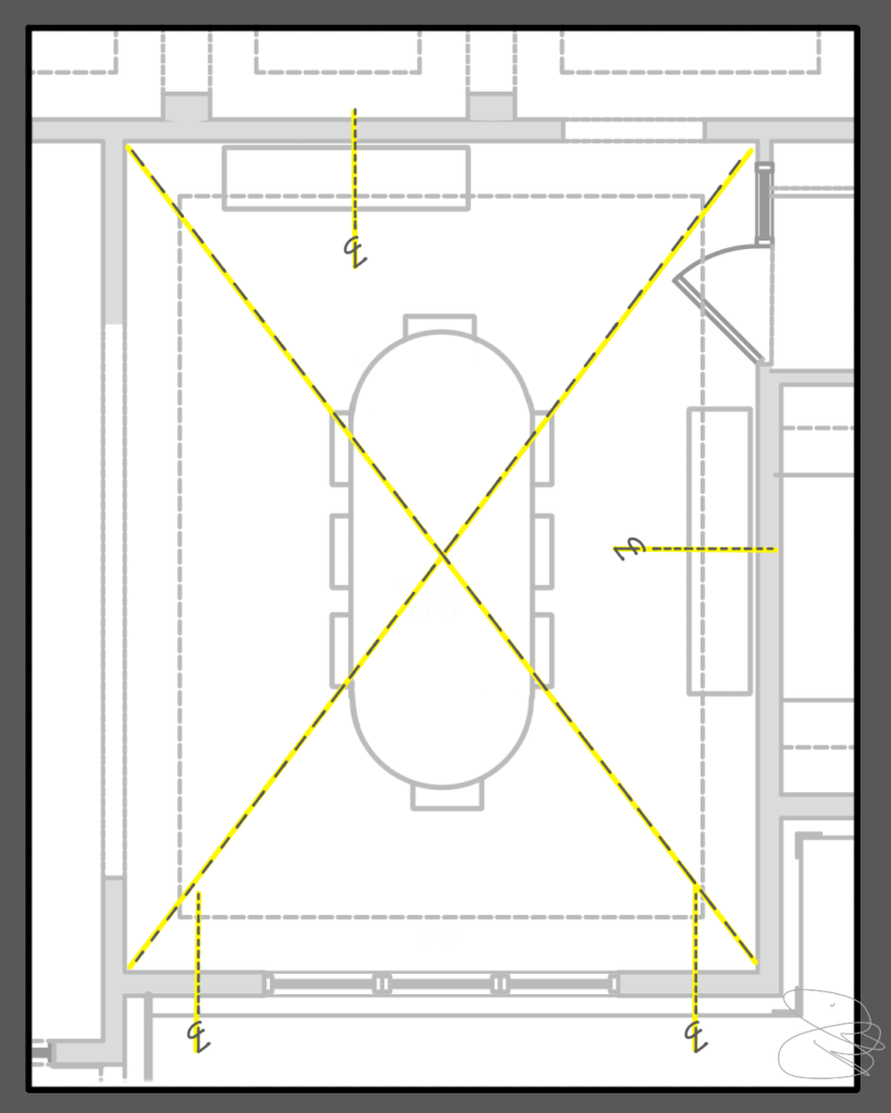
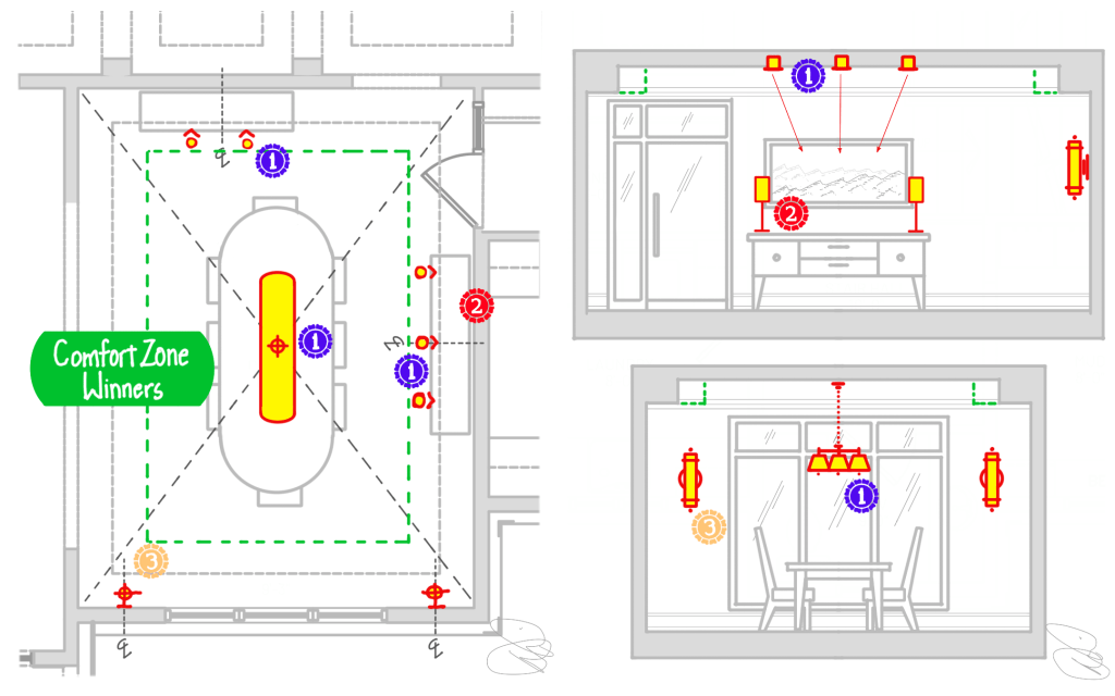
Staring at a blank plan can be intimidating, but for me the first step is always an easy one: I mark the centerlines that will guide later placement. In a dining room, a simple “x” through the room, from corner to corner, will easily and accurately locate the center of a rectangular room. There are, of course, exceptions, but in most cases, this is where the dining room table will be and where any lighting for the table should orient.
Next, I’ll make a circuit around the room’s perimeters and look at the walls. I look for wall segments – the uninterrupted walls between windows, doors, and built-ins – that are approximately 3’ or larger and thus potential places for hanging art and photography. In this room the wall at the top of the picture and the two segments to the left and right of the windows make sense as focal points.
The long wall on the right side of the room presents the first decision that requires critical thinking. I could mark the centerline of the wall segment, but the drawing shows a buffet or sideboard centered on the main table. This puts the sideboard in the center of the room but not in the center of the wall. If furniture placement was unknown, I would lean towards marking the center of the wall. However, with the piece known and likely to align with the dining table, I marked the centerline of the furniture and room, not the centerline of the wall.
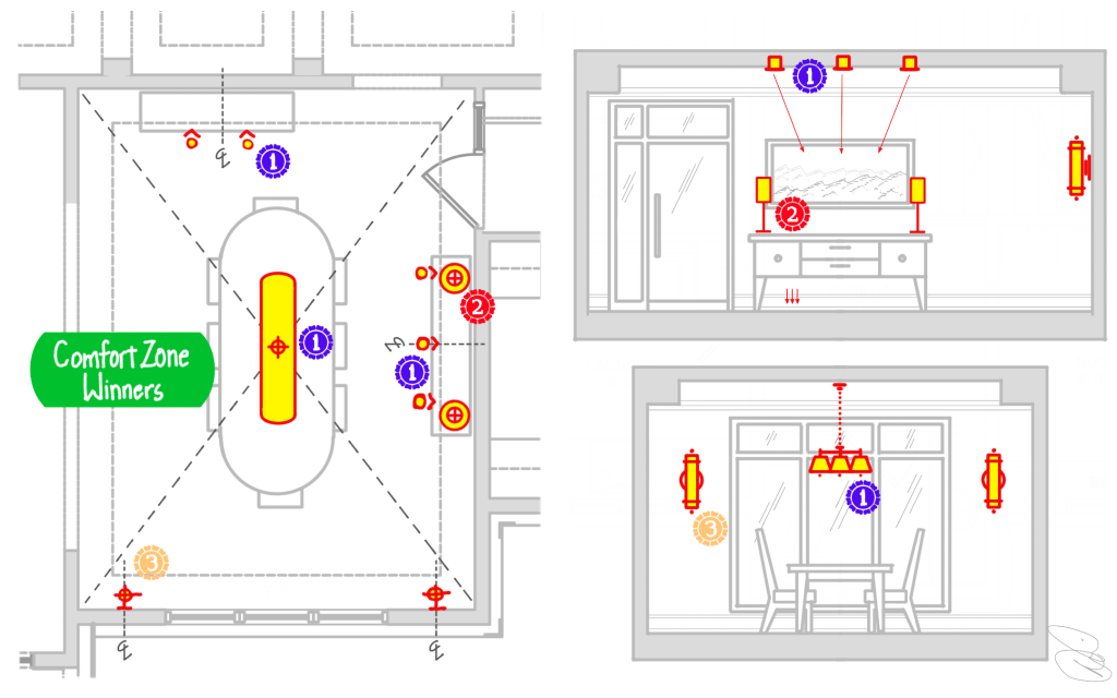
COMFORT ZONE WINNERS
I often start picking places for light fixtures in the Comfort Zone, the sweet spot of human vision out in front of us where art, windows, and the faces of loved ones across the dining room table will be. Light in the Comfort Zone should be softly diffused through shades or softly reflected off surfaces like walls, so it simulates the softness of a blue sky and maximizes our comfort. Get this Zone right and the rest of the room will typically fall into place easily.
In first place I have a tie: the dining room chandelier/pendant and recessed adjustable lights above the two sideboards. The chandelier is as close to a no-brainer as they come in lighting: we expect one to be right above the table. This is of course historically inspired but, when the fixture is chosen well, can also emit soft gentle light onto the faces of everyone seated at the table, push light downwards to the table itself, and even add a soft glow to the ceiling. I’ll get into fixture specifics later in a Pick the Products post, but for now I’ll make sure to locate a chandelier or pendant right over the table.
We also want soft light in the Comfort Zone around us in what I sometimes call a Lighting Hug, a gentle embrace of light that helps us feel good. In this dining room, recessed adjustable downlights that “aim” at the walls above the sideboards will illuminate the likely artwork before bouncing softly into the room. I waffled a bit when choosing these recessed lights over the table lamps on the sideboard but ultimately prioritized the recessed lights because you can always add lamps later but tearing into the ceiling is something most of us want to avoid. So, if you are planning your lighting, make sure you pick the right places for fixtures that will be difficult to relocate later.
You may note that I have two recessed adjustable downlights above one sideboard and three above another. There are a couple of ways to make this decision. First, you can develop spacing rules-of-thumb. In this case, a spacing of about 24”-30” means the lights will overlap each other a bit leading to nice, even illumination of the artwork. Secondly, if you know the exact art piece, you can do a little math and geometry to determine the best lighting configuration. For the sideboard on the right, where the largest piece of art in the room is likely to live, I assumed a need to cover more of the wall and went with three fixtures. Oh…hold up on that for a sec….
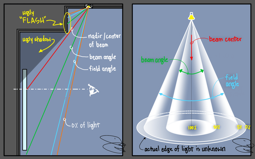
There is one more thing to notice with the recessed adjustable fixtures as I have them placed in the drawing above: they are in the wrong place in relation to the dashed line that indicates a soffit or tray ceiling. The result will be quite atrocious flashes of light on the soffit, ugly shadows on the walls and possibly artwork, and a missed opportunity. To solve this issue, we need to take a quick dive into the geometry.
This gets a little technical, but it can be helpful to understand the meaning of beam angle and field angle, both technical measurements of the beam of light emitted from a light fixture. In simple terms, as shown in the diagram on the right above, the beam angle is the area of the beam that goes from the brightest output to 50% of said bright spot. The beamangle is what is typically given by manufacturers, so you might see a recessed light that says something like “36° Beam Angle.” As you can see in the diagram, however, beam angle is just the beginning.
Light will typically fade gently from 50% to 5% beyond the beam angle, and that additional area is called the fieldangle. It is important to know the field angle when considering soffits, because it will make a bad problem much worse (when overlapping fixtures to light art or other items, however, overlapping the field angle can be quite helpful).
The diagram on the left shows the situation I just created in section view, with a downlight on the upper ceiling and art hanging on the wall below the soffit created by a tray ceiling. When properly aimed at the art, with the hotspot somewhere around eye height, note how both the beam and the field angle – and the remaining bit of light beyond the field angle – smack into the face of the soffit. Because the soffit face is so close to the light, it will be extremely brightly illuminated by an ugly flash of light, distracting at best.
This placement will also cast an ugly shadow below the soffit, which can negatively impact the art but will look bad even without the art.
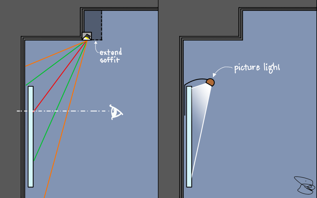
There are a couple of ways to fix this issue, two of which I share in the diagram above.
The best solution from a lighting point of view is to expand the size of the soffit until it is sufficient to contain the recessed adjustable downlight in the precise location needed. When I explain the situation to the architect or builder, accommodation is usually made but not always. The room may have other critical considerations that make expanding the soffit difficult or impossible, so it pays to have other options.
The simplest workaround is to abandon the recessed lights completely and utilize a wall-mounted picture/art light. These can be found in very modern form and in classic styles, working with about any décor, but because they are highly visible, they typically need to be coordinated with the interior designer and homeowner for aesthetic reasons.
For our sample project, I am imagining that we were able to collaborate with the architect and expand the soffit, shown above by the green dashed line, to solve our issue, at least in the dining room.
What about the Glare Zone, Work Zone, and Safety Zone? Stay tuned; a second post is already under way.
Read more of the Giving the Simple Gift of Light practical series HERE.

Leave a comment