
Blogging is a unique endeavor for me, a space for creative thinking that has no editor, no deadlines, and no restrictions. It is a space of ultimate freedom which, for someone like me, can be paralyzing. A blank page can be a scary thing. Yet blogging is also an exciting space for me, a place to practice writing and learn and grow. I can get lost among too many choices, so a little self-imposed structure can be liberating.
I began this year, as I did last year, with a rough outline of posts for several blog series that makes it easier to sit down and write. Twelve months later, I am now wrapping up an autobiographical Finding the Gift series, a theory-driven Light Can Help Us series, and a Don’t/Do This series, for which this is likely the final post.
But how does one end a series of practical-minded articles for residential lighting design when I am still learning, still exploring? How does one end a series that can have no end? I was told as a child that painting of the Golden Gate Bridge is a continual process: once painters reach one end of the bridge, so the legend goes, they simply go back to the beginning and start again. Turns out this is not the case, but it came to mind when thinking about blogging. I am reaching the end of the Don’t/Do This series. Is it time to begin again?
So let’s put the theory to test. Here is where I started in January:

I started in the kitchen, the central hub of many modern households. Kitchens also happen to be a place that needs the right light from the very beginning; it is often impractical to bring in a few lamps to fix the problem.
My first sketches established a style I would use throughout the year, moving from room to room, as I developed the series. I tried a few variations, expanded outdoors, and feel that I learned something about lighting and a little something about illustrations. So how I could I start over, like the apocryphal Golden Gate Bridge painters?
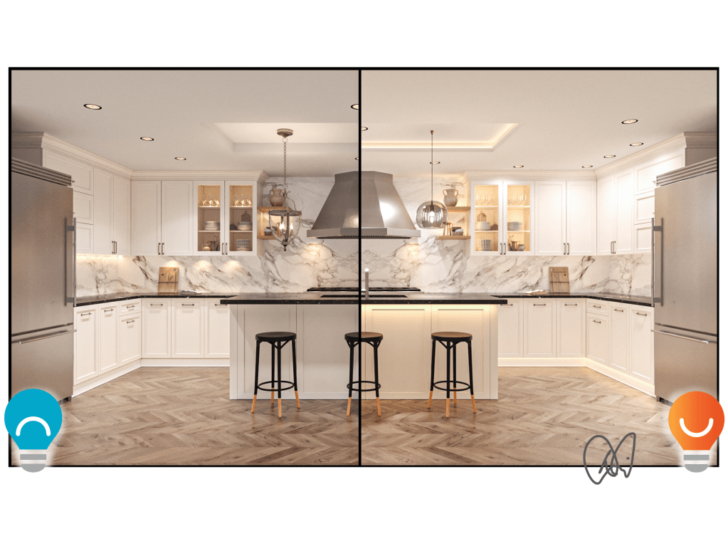
Here is one possibility: I could get help. I have been working recently with Michael, a skilled freelance 3D model builder and renderer to develop illustrations for our lighting design company. We are getting close to finishing the first round of renderings, and a thought occurred to me: what could Michael do with the Don’t/Do This sketches? Turns out he can do some pretty amazing things.

The rendering used in this post is Michael’s rough draft. Yes, that’s correct, this is his first attempt at capturing the Don’t/Do This concepts in a photo-realistic rendering, and it sure looks fancier than my sketches. We will go through a few rounds of editing before we call it done, but I thought I would go ahead and share the rough draft as I ponder the future of the content and series.
You can read the original kitchen post for more detail, but here is a quick summary of the points:
- Don’t line up downlights over the walkways where they do the least good. Do align them with upper cabinets and directly over countertops.
- Don’t leave ceiling details dead. Do use soft indirect cove lighting to chase shadows and increase comfort.
- Don’t use puck lights in the tops of glass-fronted cabinets where they will blind you. Do use linear light placed vertically and pushing backwards into the cabinets for a soft, even glow.
- Don’t light underneath floating shelves above your eyes; you will see the light as glare. Do point shelf lighting away from your eyes, like upwards as shown here.
- Don’t use light fixtures with bare bulbs; they will only produce glare. Do use light fixtures that conceal the light bulb and let light out softly (even more softly than show here…we’re working on the illustration).
- Don’t push undercabinet lighting up against the backsplash, and don’t use puck lights. Do pull the light forward to avoid hot spots on the backsplash and put useable light where you need it most.
- Don’t leave your floors dark and count on overhead lighting after sunset; light overhead can be disruptive to your sleep. Do install toe-kick lighting for late-night use.
- Don’t leave your floors dark, part two. Do install under-bar top light for late-night navigation and an increased sense of comfort when sitting.
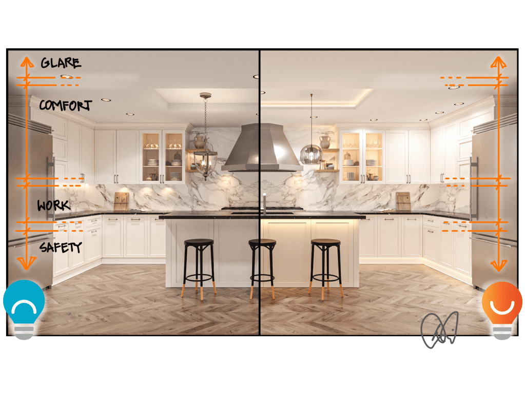
If you have been following along in my Light Can Help Us series, you may have noticed that I took a proverbial left turn in the latest post. Instead of focusing on the promises of light, I divided space into zones based on how our eyes (and brains) work. So perhaps, if I revisit the Don’t/Do This series in the future, I may eschew the numbered system and try out the zone approach.
- Glare Zone. Protect your eyes from bright overhead lighting whenever possible. There is no need for recessed downlights directly over aisles; push them to the perimeter and bounce some of the light off of upper cabinets.
- Comfort Zone. We need soft reflected light in the comfort zone, pointed away from our eyes. This can come from shaded pendants, light bounced off cabinet fronts, shelf and glass cabinet lighting, and indirect lighting above cabinets and in ceiling coves.
- Work Zone. We need strong directed light where our hands hold knives, operate stoves, wash dishes, and do homework. Whenever possible, keep the source of this light below eye level and point it downwards, away from your eyes.
- Safety Zone. Use light selectively and minimally in the safety zone to light paths in the kitchen (and everywhere). Too much light at night can disturb our sleep and contribute to a bevy of health issues, so good night lighting is crucial. The best will be located below our waistlines and directed at the floor from hidden or shielded sources.
What do you think? Are my simple sketches more or less helpful than a beautiful rendering? Do they each have strengths or weaknesses? Should there be both?
I have reached the end of the bridge painting project, but before I start over from the beginning, I might take a break and go paint something else. Maybe I’ll start the series over from the beginning. Maybe I’ll try pulling together everything I can on kitchen lighting and self-publish a self-help guide, and then move on to the next room. There are a lot of maybes.
And that is half the fun of blogging.
Read more of my Don’t/Do This series HERE.

I really like Michael’s contribution! If he adds this to all you Don’t/Do This articles, you have a trend-setting book!
LikeLike
Thanks, David! An idea is taking shape….
LikeLike
Ah, yes, David, the joy and consternation of reinventing yourself! I know this feeling well. So, with that in mind, I love how youâre moving into hyper-realistic imaging. Iâve been experimenting with that to convey how my designs feeâand âfeelâ is the correct term, I believe, for how we ultimately judge thingsâfor a couple years, using an interesting fellow I tracked down in Brisbane, AU. (The world is getting smallerâ¦)
My point is this: Consider revisiting your Donât/Do This series with two changes that will get your juices running again. One, add the 3D drawings. Two, collaborate with other designers and mine their real world installations to spice up things. Plus, you can interact with them and incorporate their oblique-to-you insights into your narrative.
I took this approach to my design business, feeling I was 1) getting bored and maybe getting in a rut of understanding, and 2) wanting to experiment with what I believe is the model for your business and mine in the 21st century: collaboration. In that state of mind, I connected with a colleague, Kirsten Conner, who has her own design firm, took her out to lunch, and proposed we collaborate on selected projects together. Her focus would be finishes, including soft goods like pillows, curtains, rugs, and furniture, mine would be shaping the space to tune it to Lifestyle Activities, Interior Flow, Feelings Desired, and Exterior ConnectionsâL.I.F.E. She comes at our collaboration with an often contrary view to mine, and I love it! We hammer out our differences and, to no oneâs surprise, the collaboration leads to something better than either of us would have done, if left to our own devices.
Not only did it revitalize my interest, it has led to multiple award winning projects! Iâm back in the game! http://www.kiricdesign.com http://www.kiricdesign.com is our collaborative landing page.
So, go ahead. Reinvent the Donât/Do This wheel!
Yours for a decrease in entropy,
LikeLike
Great suggestions!!
LikeLike
Both! I love your sketches and they make lighting conceptually more accessible and friendly-feeling. But the renderings offer clarity and a sense of ambiance the sketches don’t convey. A super powerful 1-2 combination!!
LikeLike
Thanks, Sara!
LikeLike
I absolutely love your Don’t/Do This series! It is my favorite of all your blogs. I did notice that the mudroom and laundry room were not covered. Is that because they would be similar to the kitchen lighting plan? If not, would you consider adding them to your updated series? Hubby and I are getting ready to remodel our home and will have a mudroom/laundry room combo added. Please and thank you!
LikeLike
Thanks for the kind words, Moni! Mudroom and Laundry rooms can be similar to kitchens, but I’ll certainly consider a post on them. You can find some about those spaces in my 1THING: New Build Disc Light post. https://languageoflight.blog/2022/12/07/1thing-new-builds-with-disk-lights/
LikeLike